Remote Learning PlatformGoal:
Create a user friendly design for a product that focuses on enhancing engagement in online classes for higher education.
Steps:
Create a design
Test it
Re-design
Step 1: Create a Design
Conducting Research
For this section, we aim to understand the effective use of online learning for engagement from the perspective of instructors and students. For this goal, the team identified potential candidates and, with informed consent, interviewed and recorded ten participants. (five instructors and five students). These interview findings were consolidated, finding two main areas of concern: Communication disconnection (section 3.1) and zoom technical difficulties (section 3.2). These findings are further analyzed to create personas for detailing users' key pain points, habits and preferences.
We identified that the instructor and students felt a lack of engagement in class. On contextual inquiries, we found there are four main reasons;
1. No visual cues
2. The monologue format of learning needs to be switched to dialogue
3. Lack of motivation without incentives
4. Diverted Attention - Multitasking
Possible Improvement
Technical Zoom Limitations for Live Lectures
The chat feature is cluttered when students respond simultaneously
The virtual hand-raise feature is not adequately visible to grab the attention
No tools for students to self-regulate their engagement in an online class
Poor audio and video quality decreases students’ in-class focus
Based on our interview findings we were able to create personas with the appropriate preferences and pain points.
Student Personas
Professor Persona
FLOW #1
Entering class and networking with classmates
Pain point addressed: I am unable to connect with the instructor and classmates before or after class because of the zoom timer limitation.
How it was addressed: An allotted time was created to interact with classmates with the ability of chatting and viewing their profiles.
FLOW #2
Interacting with instructor
Pain point addressed: Chat rooms are not effective because the instructor does not see the questions immediately.
Pain point addressed: I don't like when students talk over each other.
How it was addressed: Users can ask questions and pin them on the progress bar. This helps students ask their questions and can get a response when the teacher is available.
FLOW #3
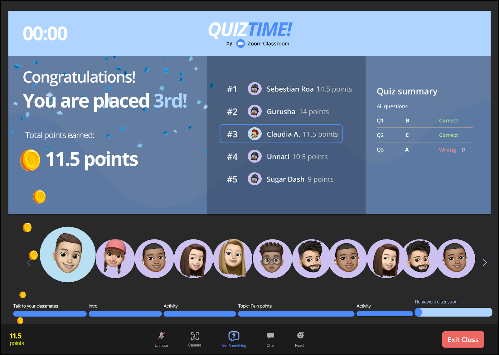
Student interacting with quiz activities
Pain point addressed: I get bored when the class is taught in a monologue format.
Pain point addressed: Sometimes I feel bad when I am inattentive in class but I don’t know how to participate.
How it was addressed: Activities like short interactive quizzes are added to keep the lecture interesting but also to address if students have trouble with the material.
Step 2: Test it
Test Plan
#1 . Selecting the flow and parameters for evaluation
Our first discussion entailed deciding on the flow to be tested through usability evaluation. We chose to test the ‘In-class’ activity flow because it aimed to solve Max- The Multitasker’s problem of staying motivated and attentive throughout the online class.
To ensure that we gathered feedback on our long-standing goal to improve engagement in a virtual classroom, we captured the following metrics:
Success rate (did the user successfully complete the task?)
Completion time (how long did it take for the user to complete their task?)
Points of struggle within the flow (where did the participants struggle in the task?)
Perceived difficulty of performing the task (participants’ perception of the task difficulty)
Subjective engagement rate (participants’ objective rating and subjective opinion on how engaging is the application)
We collected this data through in-task observation, post-task interview and a 13-question survey(based on the User Engagement Scale).
#2. Setting the participant selection criteria
Team members recruited participants to match the following criteria:
They should be a university student
They have experience of attending online classes using video conferencing applications like Zoom, Google Meets, Microsoft Teams
#3. Preparing the test material
The following material was set in place before team members could start conducting the evaluation:
Working Figma prototype of the in-class activity flow
Pre and post task consent script
General test instruction script and task instructions
Qualitative question depository for post-task interview
Google Form questionnaire for collecting participant ratings
Step 4: Conducting usability testing
Each member of the group conducted 1 informal usability test. We prepared our introduction of the app, tasks the user needs to complete, and their consent to collect their information and data to improve our design in Google documents. Our individual usability testing consisted of a mix of in-person testing and remote testing through Zoom, collecting our data through note taking and audio recording. In the end, we asked the testers to fill out the Google Form questionnaire for collecting participant ratings. Brief details regarding instructions and consent can be found in the Appendix section.
Findings and Recommendations Summary
After conducting usability testing and receiving overall optimistic feedback, we developed a deeper understanding of how users interact with our design mockups. This activity allowed us to pinpoint the features that had the scope for improvement to reach our desired goal.
Discovery #1:
Our findings reflected that the hint button needed to be more prominent because users took longer than 40 seconds to notice the hint button on average. In 3/5 cases, users felt they needed clarification about its rules.
Recommendation:Enhance the hint display with a yellow highlight and a bubble that reminds the user after 5 seconds to use the hint if they haven't used it already. In addition, offer informative feedback for the number of hints used and the remaining available, which is only once during the entire lecture.
Discovery #2:
Users needed clarification on the Spin the wheel feature. 40% of the users needed help understanding the purpose of this feature and were inclined to click the wheel itself to make it spin instead of the spin wheel button.
Recommendation:Enable visibility of system status by adding a pre-screen to introduce the feature and re-state the activity. Providing sufficient time to interact with this feature and make the wheel area clickable could help users familiarize themselves and operate confidently.
Discovery #3:
Eliminate irrelevant display of fellow student avatars during activity time.
Recommendation: Avatars should be hidden during activities to keep the design simple. It will not only allow users to focus on their class activities but also serve as a better use of the space.
Project-Self Reflections:
After completing project 4, our team discussed scaling our research's effectiveness and our scope of improvement as budding UX researchers and designers. We realised our usability questions could have been more useful using user terminology instead of words such as cumbersome, complex, and activity. Moreover, our mock questions were tailored for HCI students unintentionally and seemed challenging for non-HCI students during our testing; that is an area we would be careful of in the future and use generic topics. Overall, as a team, we would conduct a mock usability testing before testing with real users, so each team member is testing precisely in the same fashion and avoiding confounding bias. In the future, we recommend more rounds of usability testing to scale this application in the market.
Improved design
#1 - Hint Button
Our initial hint button had a yellow stroke and had no indication about how many times it can be used. Also, some users were not able to visually detect the hint button in some circumstances.
Redesigning Hint Button
Hint button is more visible with adjusted yellow color and provides the number of hints that can be used.
Clarification for students to use the hint button if students take more than 5 seconds to answer.
Indicates that the Hint button is not clickable/available after one use.
Improved design
#2 - Spin the Wheel
Our previous design made some users confused about what the spin the wheel section is about. In addition, most users attempted to click on the wheel instead of the spin now button.
Redesigning Spin the Wheel
New instructions regarding the spin the wheel are added and clarified that users can now click on the wheel.
Spin now button is now removed and users have increased clickable area to press anywhere on the wheel to land the topic. It gives them sufficient time to read the information, updating them about their topic.
Select Works
Centurion Insurance
Travel App


