Travel App PrototypeOverview:
This prototype was created as a project for an HCI graduate class. It was developed by a group of 4 people, including myself. This report will explain each step of the creation of this prototype to provide a clear understanding of our process.
Objective:
Develop a user friendly travel app that can compete with established brands.
Competitive Analysis
We considered two Apps for the competitive analysis of our idea.
Tripit is a popular App that allows users to sync their inbox with the App and creates an itinerary as per the bookings found in the user’s emails. This makes the user stress free and helps them avoid missing any bookings that they make.
We studied the Trip Advisor App which is another well known website and app used by people across the world. It mostly helps a user know about a country or city they plan to visit by suggesting the most popular places to visit, eat and move around. It mainly focuses on content rather than on helping the user to plan. They do have an option to create an itinerary but must be created by the user themselves.
Competitive Analysis
We considered two Apps for the competitive analysis of our idea.
Ideas:
Focus on personalization and fighting decision fatigue by creating a suggested itinerary based on account details.
We have used the likert’s scale, 0 - 5.
0 being the least satisfying and 5 being the most satisfying.
Flow :
Creating an itinerary for a user exploring a new city.
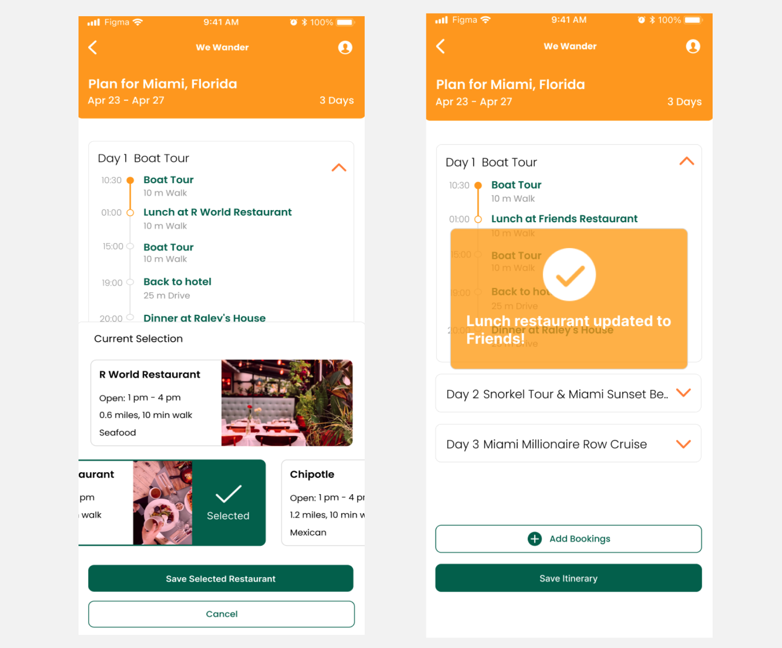
Change suggested Restaurant.
-simplified
-having an itinerary ready
interface: Mobile
Created by each member of the team (3-6 people)
Each person takes 10 mins to generate 3-4 simple sketches
The group spends 10-15 minutes to generate a single sketch
The team presented the sketches to each other
Groups either refine their sketches or work on a single common sketch Idea
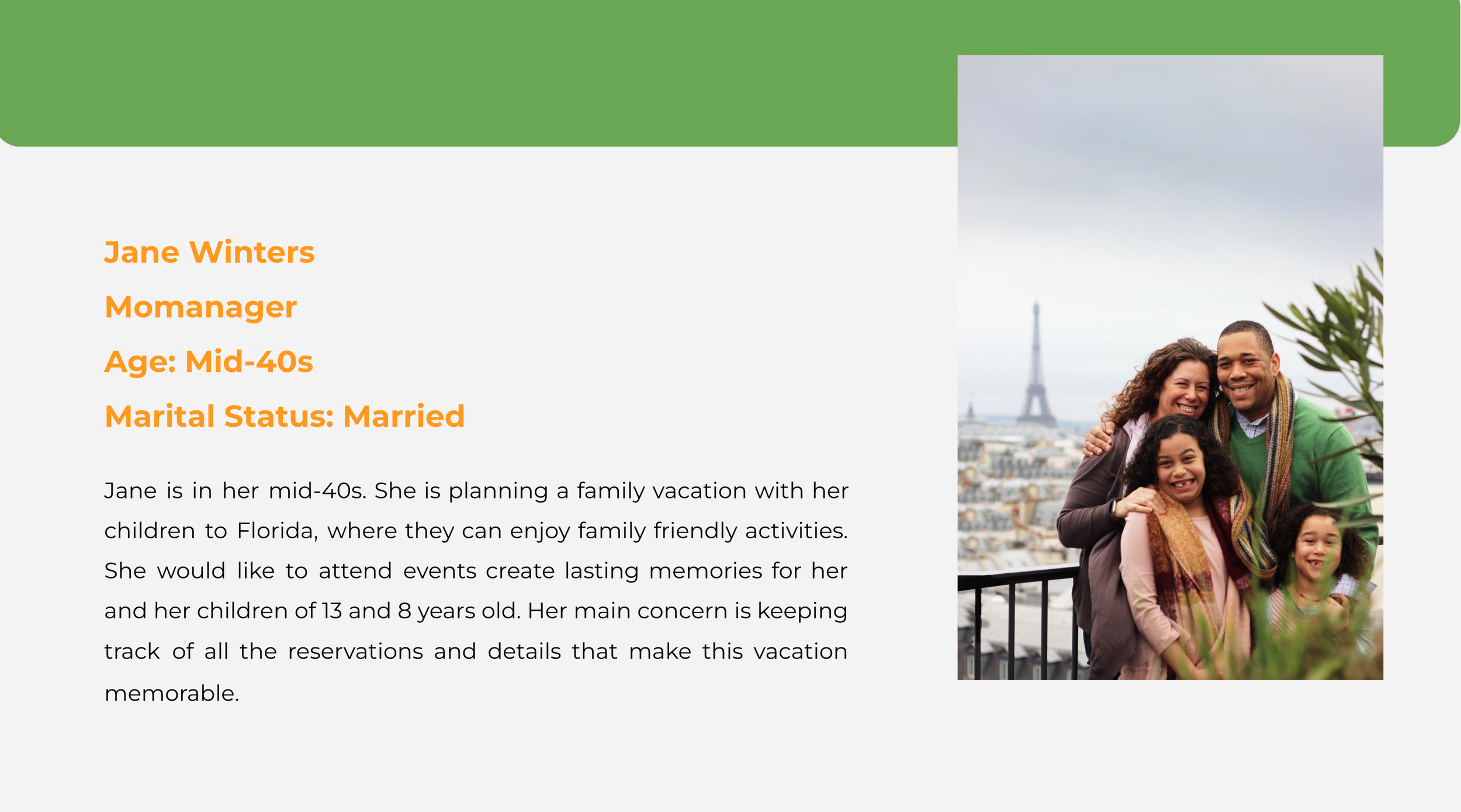
Key Persona
Low- Fidelity Wireframe
We recruited 8 participants through Depaul University's participant pool and volunteers. All participants were graduate students between the ages of 18-28 from various academic programs and backgrounds.
The test consisted of four tasks based on a scenario that were completed using the “We Wander” functional prototype.(Show Prototype) Participants were encouraged to be vocal about their thoughts throughout the tasks. After each task was completed, follow up questions were asked in order to completely understand the user's experience. All observations were conducted via zoom by providing the participants with the prototype and meeting link. The tests were recorded and transcribed so they could be analyzed by team members.
All of the data collected will be viewed by members of our team and will be used exclusively within the scope of this school project. This includes notes and video-recordings.
Testing
Task Prompts
This section provides the predetermined tasks and questions used during testing.
Mobile
Task 1:
You are planning a trip to Miami with your family and want to find activities to do. You have the we wander app on your mobile device. The App has created an itinerary according to your preferences, try to look for it.
Post-Task Follow-up Questions:
Explain the difficulties that you had looking for the itinerary?
What was the most challenging or confusing part about looking for the itinerary?
Can you tell me what was the easiest part of the task?
Can you explain to me if you had problems with the format or language that you encountered in this task?
Task 2:
You are on the We Wander App homepage. You would like to review your existing itinerary, you take a look at it. For lunch on Day 1, you realize you would rather have pasta than Seafood. You try to change the restaurant as per the cuisine. In the end you save your itinerary.
Post-Task Follow-up Questions:
Can you explain to me another way you would suggest locating your existing itinerary? Why is this better?
Can you explain whether it was easy or not to change your preferred lunch or restaurant?
What would you recommend the layout to be when determining your preferred restaurant?
Color Palette
Moodboard
The moodboard was created with the purpose of invoking a sleek and inviting design that prioritizes simplicity. With soft rounded corners, images will be on the forefront of most pages to create excitement for the user’s upcoming trip.
Changes made:
Included a feature to add a new member of the group. Meaning someone else who’s going on the trip.
Confirmation Message
High-Fidelity Wireframe
High-Fidelity Wireframe
My roles in this project
Developed high fidelity wireframe for screens 1-4 using Figma.
Choose a color pallet and created a moodboard to solidify the look and feel of the product.
Administered the testing of two participants through Zoom.
Aided in the brainstorming phase and created wireframe sketches.
Recommendations for future projects
Conduct more rounds of testing.
Develop the prototype beyond the happy path.
Develop a second version of the design and test them simultaneously.
Select Works
Remote Learning Platform
Centurion Insurance


